Problem
Glassnote began as a logo redesign project. Their existing logo is direct, but lacks much connotative value. It acts more like a monogram or even an abbreviation.
Solution
Glassnote is an existing record label, who boasts well-known clients and prestigious indie label awards. With this in mind, I brought more connotation to their logo, in a cleaner and more modern style. This redesign was then expanded to a full rebrand, creating an identity and laying out a brand guide in which to implement it.
Process
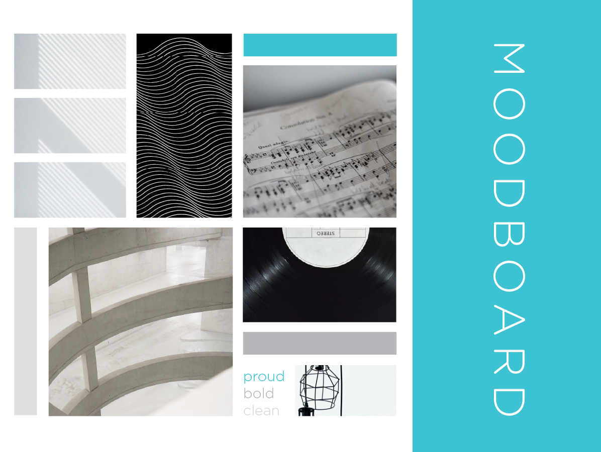
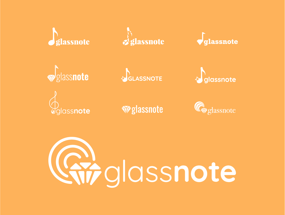
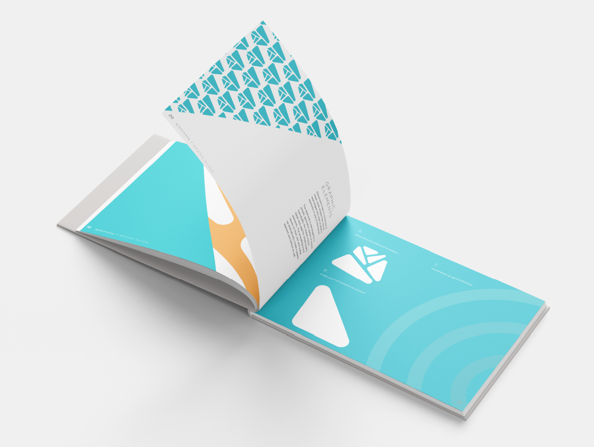
I defined the look and feel of the new logo as proud, bold, and clean. The shapes are bold, the lines are clean, and it is simple and modern. I pulled in the diamond element to represent glass and prestige. High-end vinyl record players use a diamond stylus, offering high-fielity sound. Glassnote boasts of several accolades, so I wanted to bring in an element of quality in addition to music and sound.
My process was to get out any rough ideas first, and then begin refining. I quickly realized that my initial iterations didn't meet the brand goals I had in mind. As I expanded, I returned to things that were working, to combine elements into a cohesive logo that had the appropriate feel for the brand. Secondary logos followed as I expanded into a full branding identity.
Initial iterations were too expected and heavy, not modern enough. As I refined, I improved the tone and aesthetic, but music note imagery was too expected. I started revisiting the diamond idea, combining with elements from music note configuration that were working for the final solution.
Result
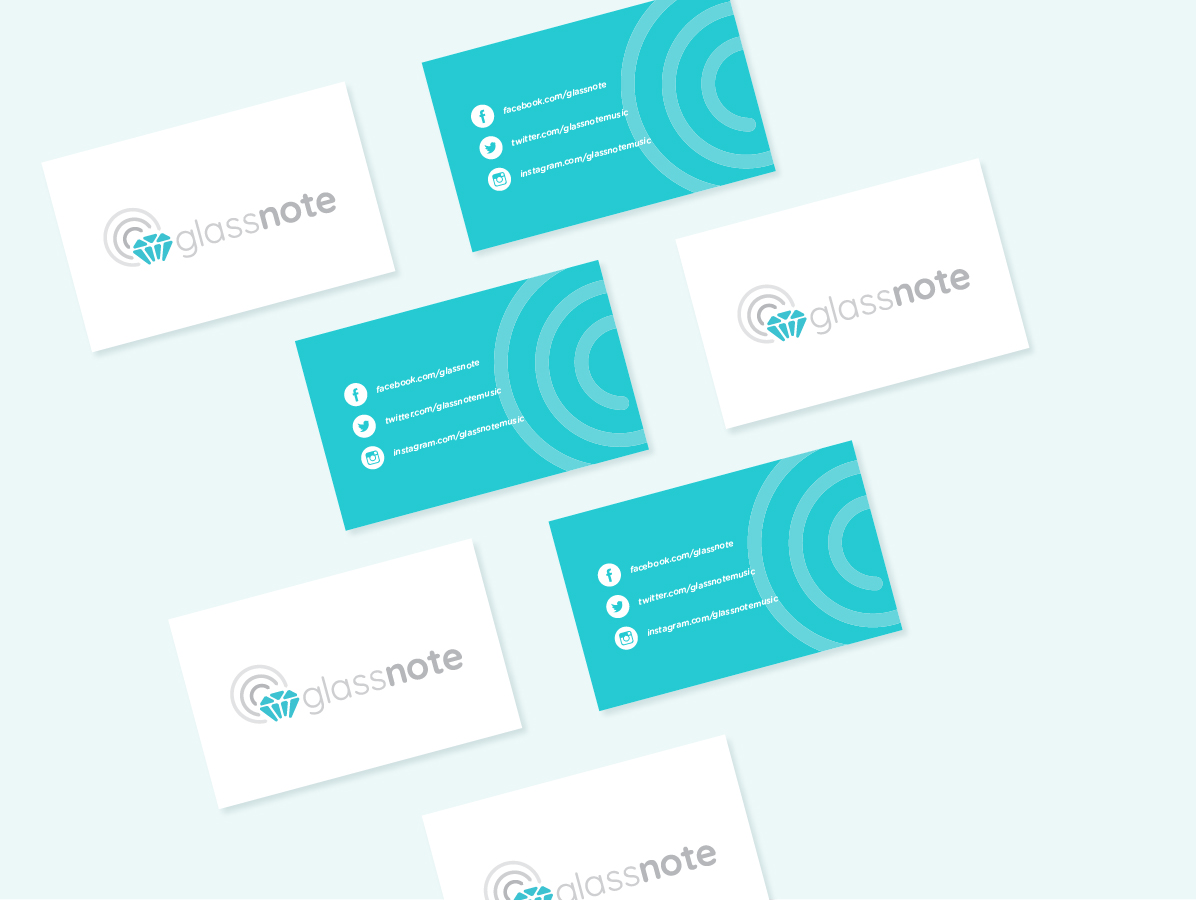
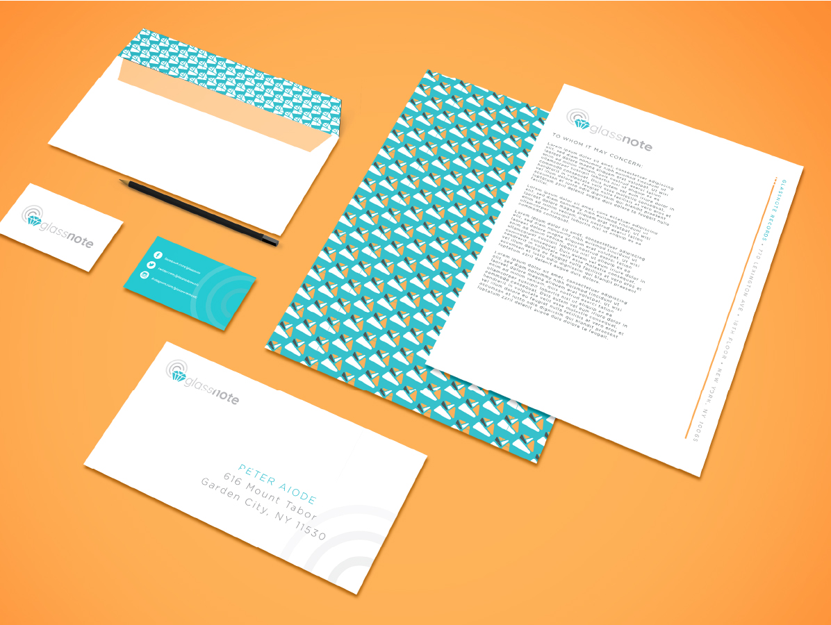
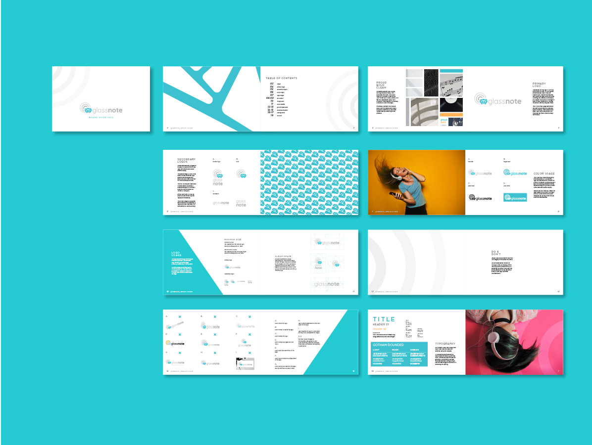
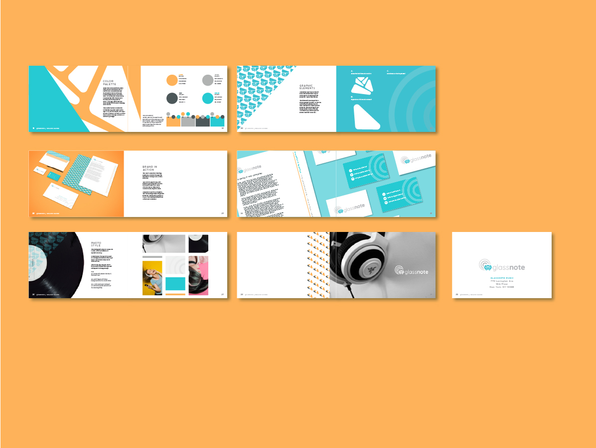
The final solution included a primary logo, secondary logos, a complete brand identity system with color palette, typography, graphic elements, and a comprehensive brand guide. The identity was expanded into a functional system that could be applied across various applications including stationery, social media, and marketing materials.
Beyond the logo, I expanded it into a full-fledged identity. This included stationery and accompanying brand guide. The identity was applied across varying applications to properly identify the company and fully brand it. The brand system featured a defined type treatment, color, and graphic elements to push the identity beyond just a logo.
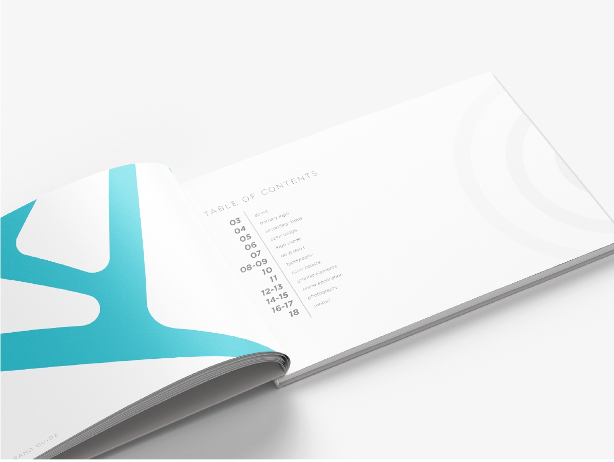
The final component was to lay out a brand guide, detailing how to put all of these elements together to use as a cohesive brand identity system. The guide included logo usage, color palette, typography specifications, graphic elements, and brand applications.