Problem
Glim came out of a single package design project. I realized there is a lack of presence in the candle industry; not many have their own retail location. I wanted to fill this void.
Solution
An initial packaging concept got a revamp, along with development into a full branding identity and a retail space. This allowed for the defining of a look and feel for the identity, capturing its essence through all aspects.
Process
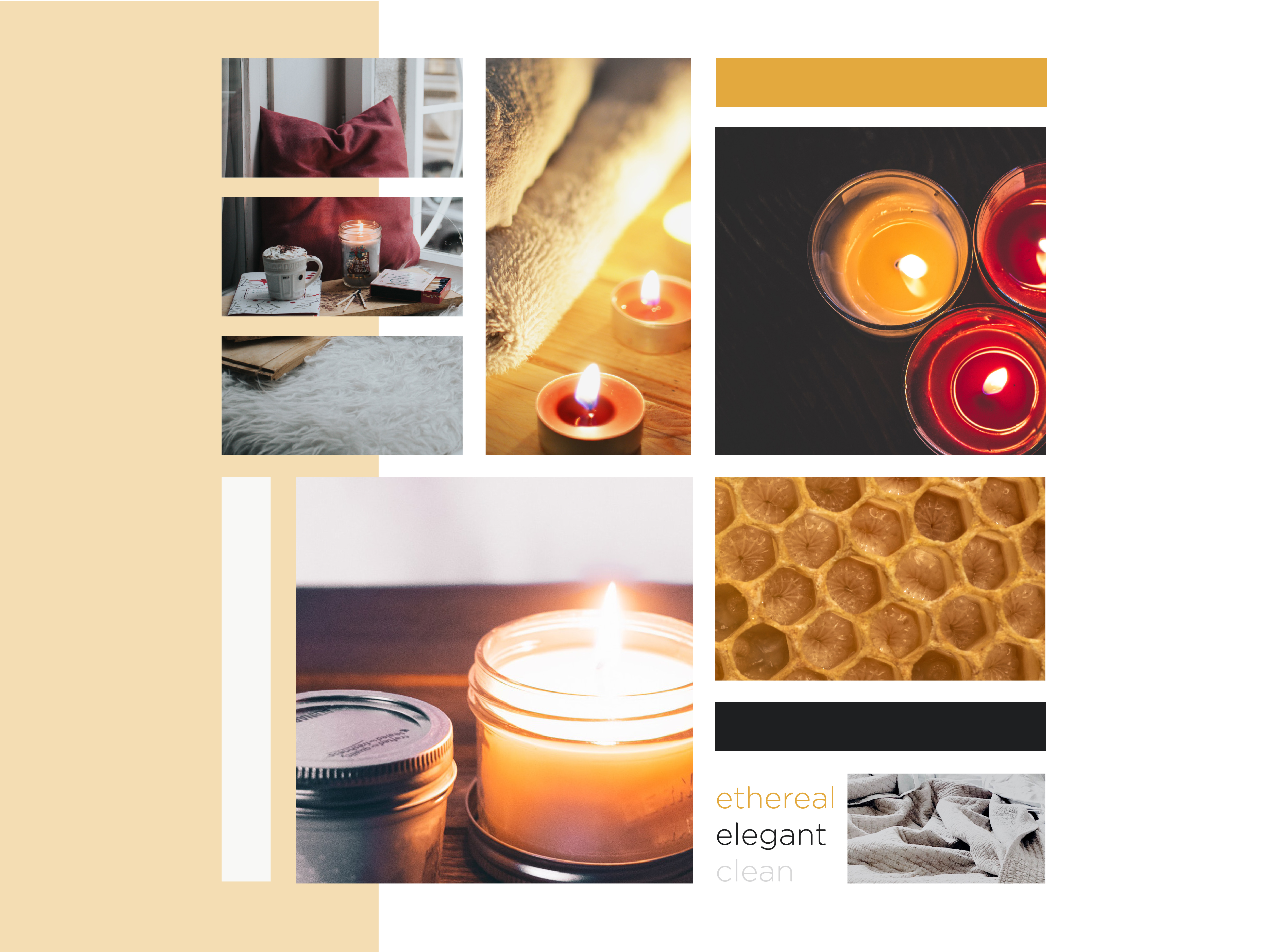
I defined the look and feel I wanted to create with the new logo as ethereal, elegant, and clean. The logotype is simple and clean with an airy feel, like wisps of smoke. I pulled in an accompanying serif to provide a touch of old-world elegance to the mark.
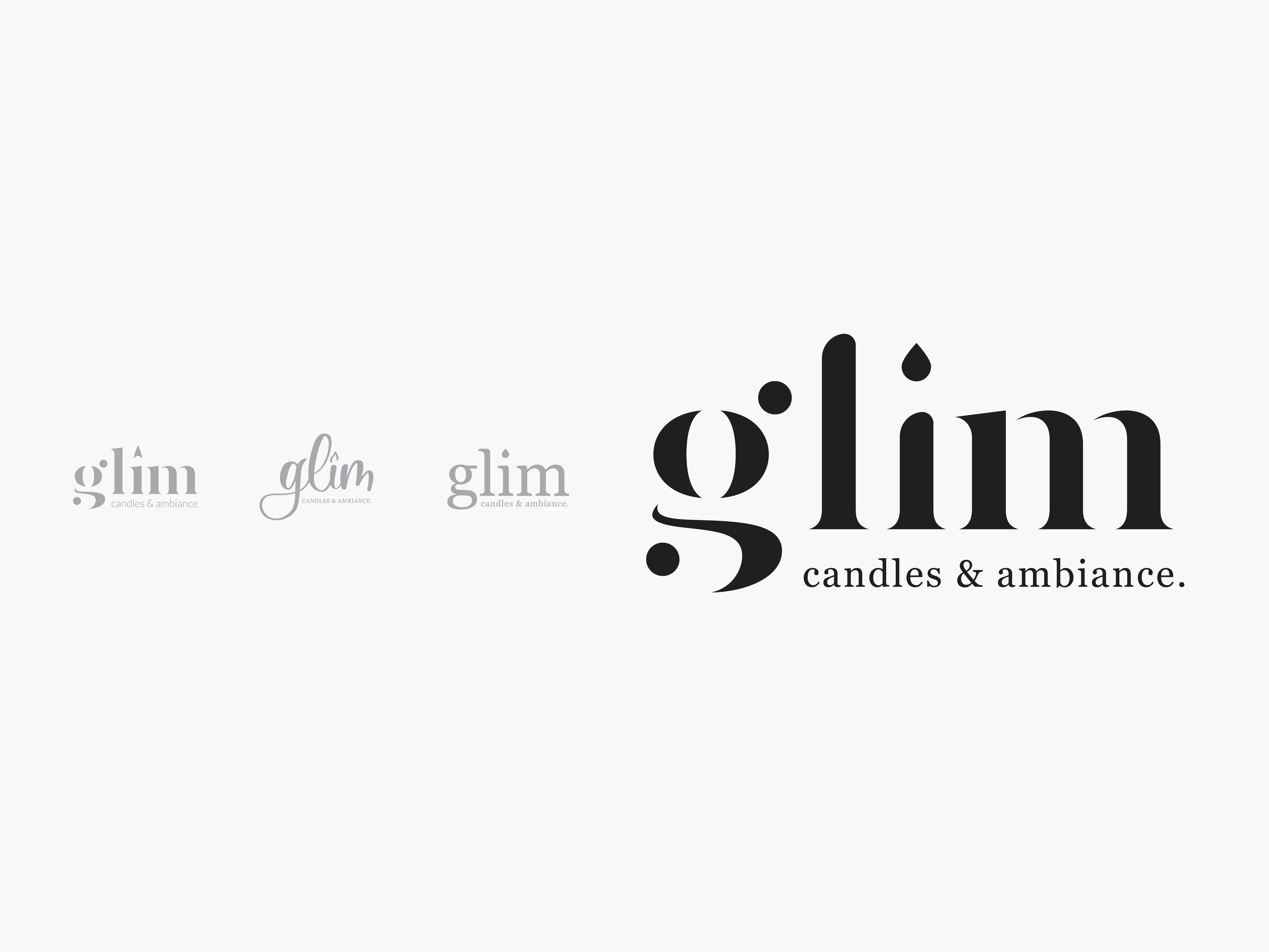
I aimed for a specific logo style for this project. While capturing the feel I wanted for the brand, I focused on a logotype-based solution. Initial iterations were too decorative; I pushed my comfort zone to use serif typeface for accompanying text instead of sans. After refinement, the typeface was too square, and the flame too much like a water drop. The final solution had nice candle-like aesthetics without being too obvious; I enjoyed the dot that is barely a flame.
Result
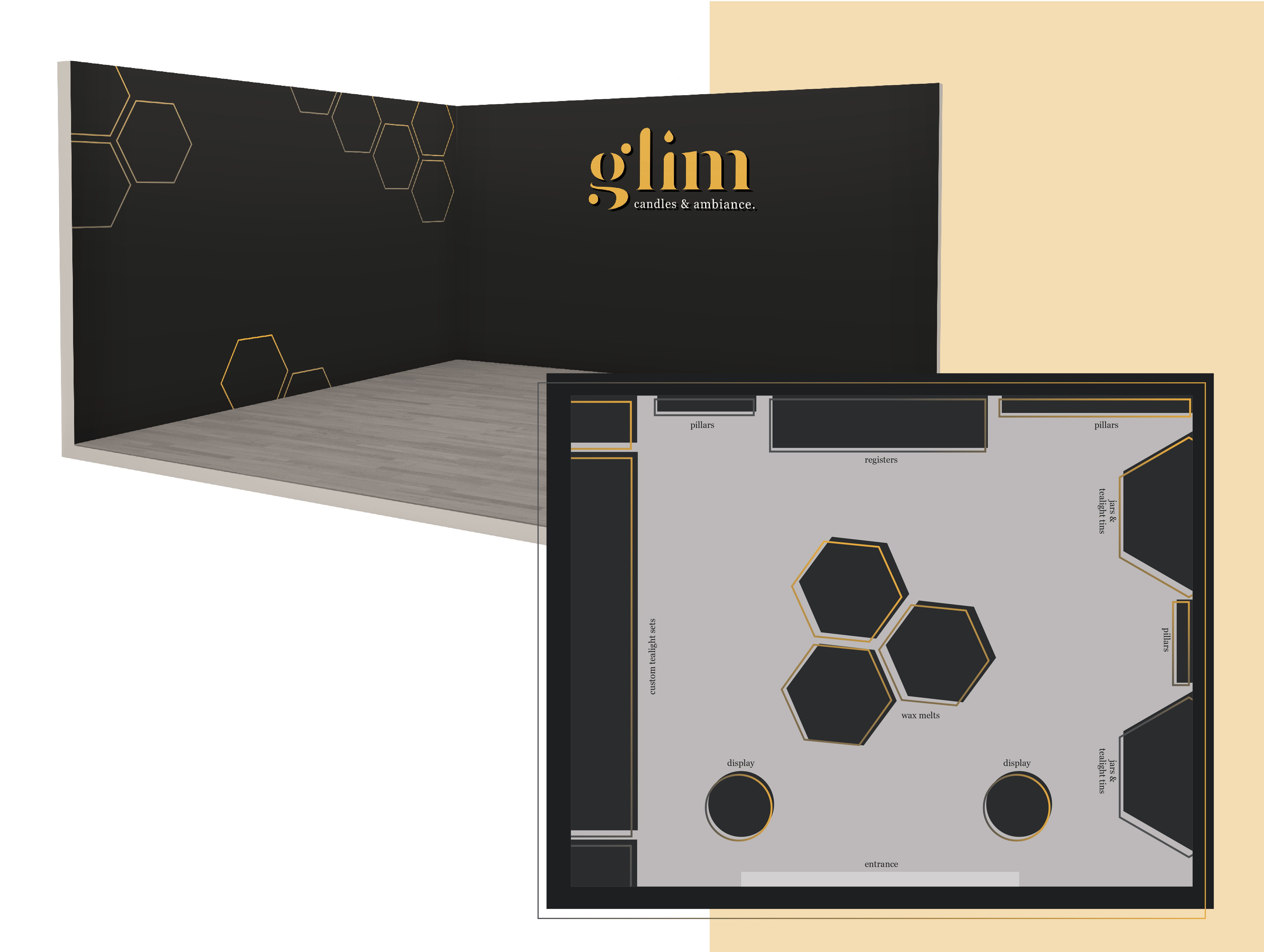
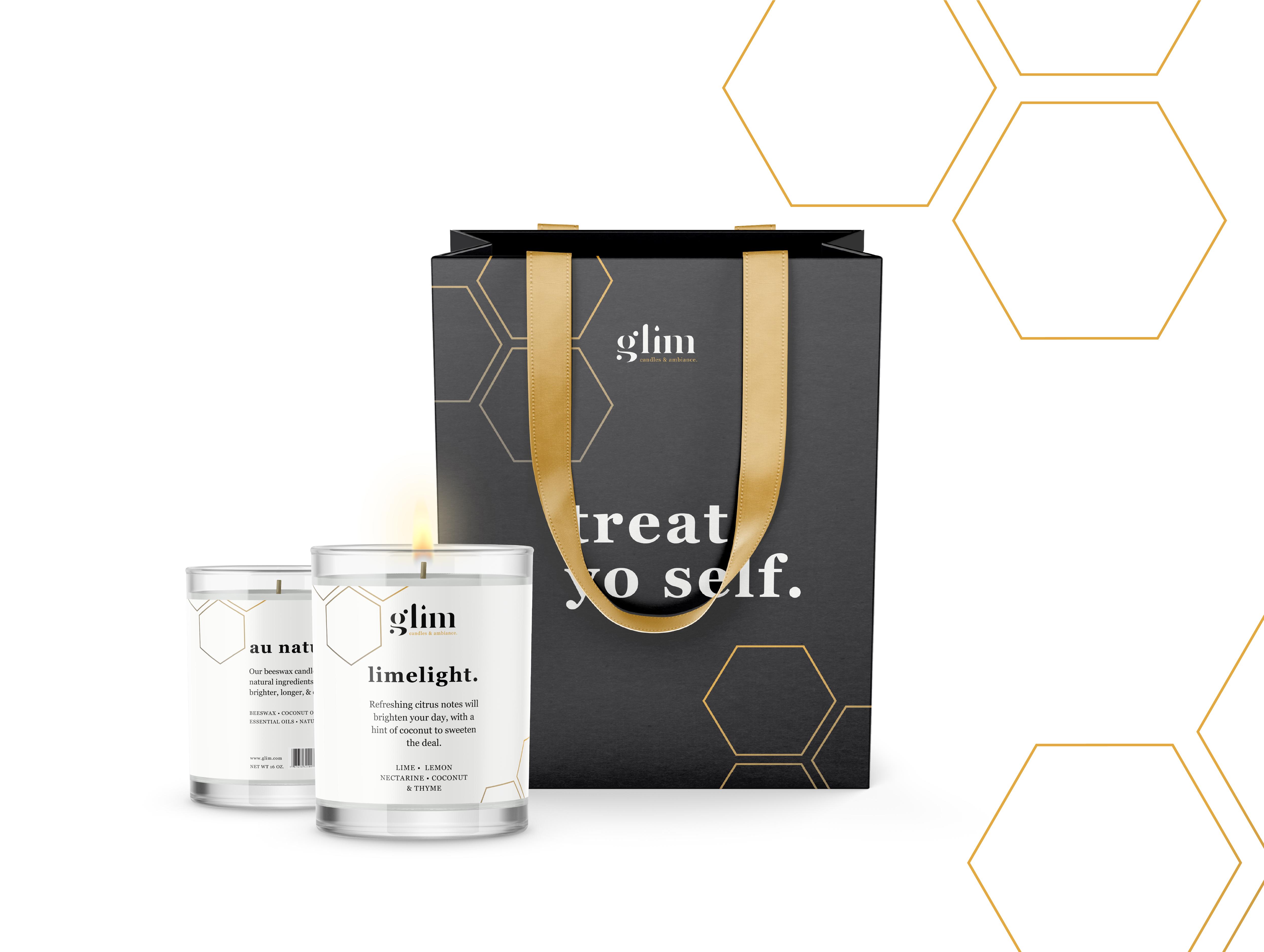
With a successful logo configured, I expanded it into a full identity; this included packaging and integration into a retail location. I designed Glim to be a boutique shop in malls or outdoor strips, that focuses on candles and the experience of creating your own ambiance through them.
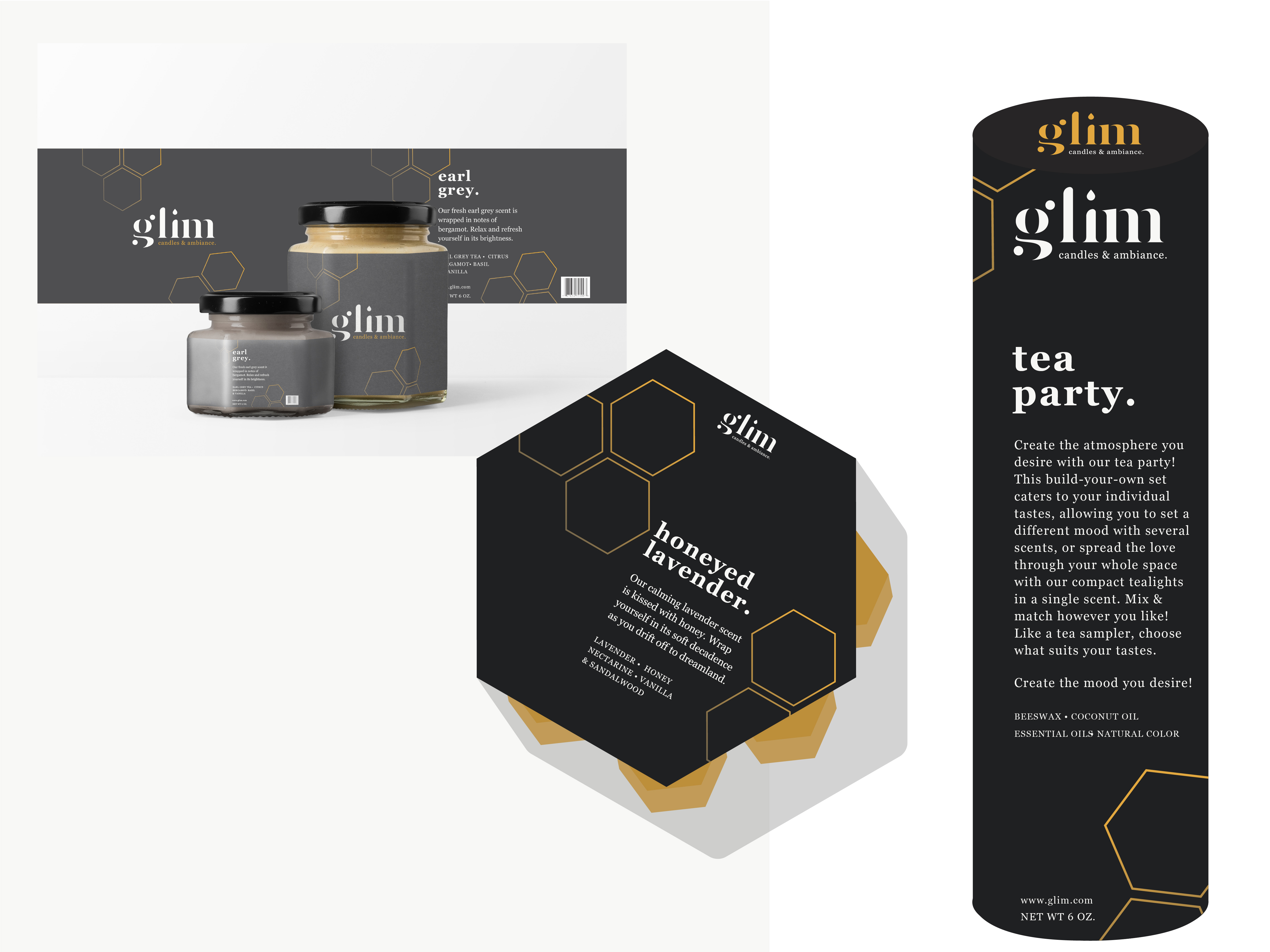
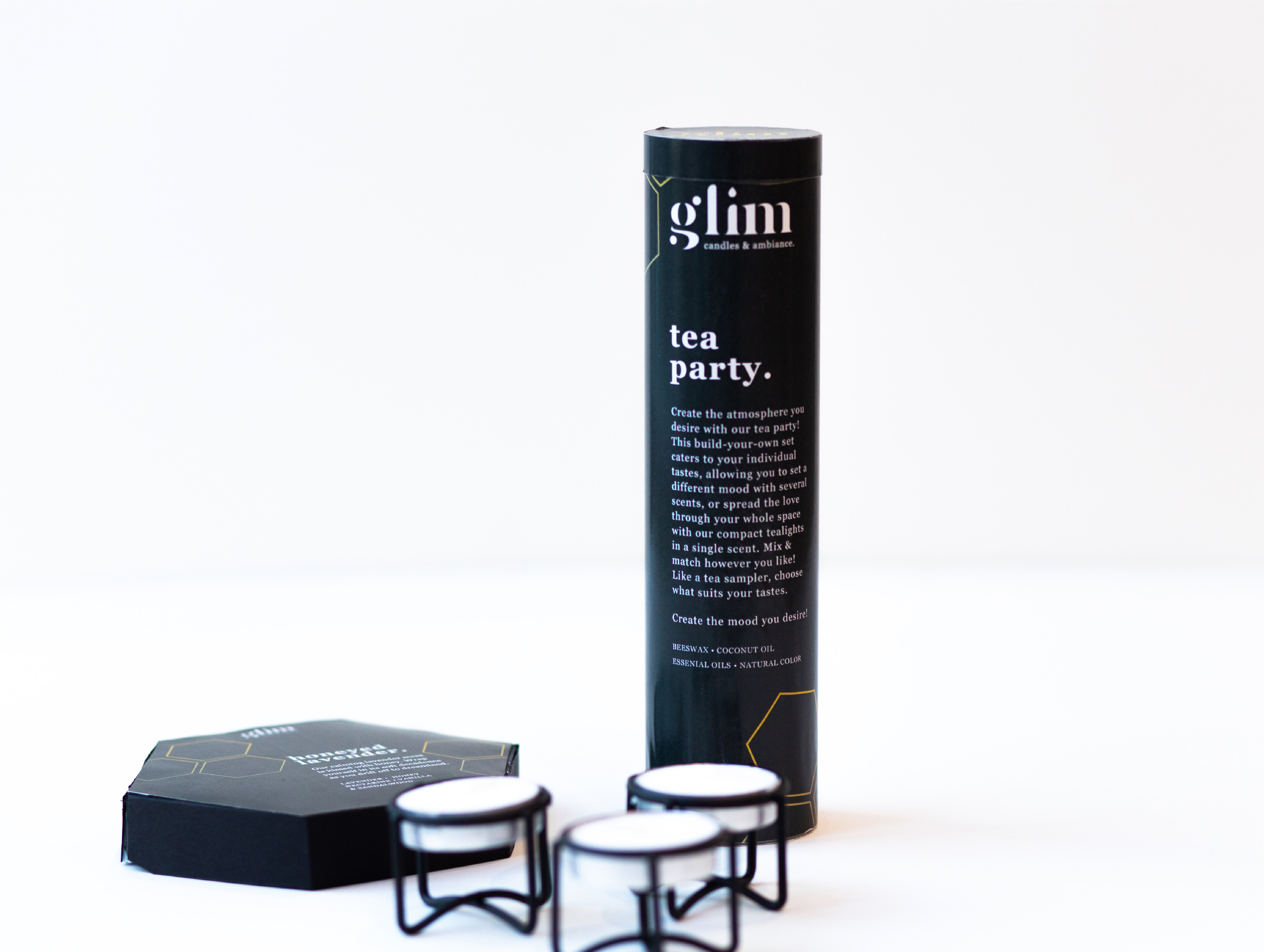
I approached packaging with a unified look but subtle variances across different types of packaging. I specifically chose not to brand the flavors/scents but instead the product lines. This included hexagonal boxes containing hexagon-shaped wax melts, jars, tealight tins, and pillar candles. To get an idea of how the packaging could come together, I prototyped through vector illustrations. This helped me visualize how the packaging could actually exist, excluding limits of material.